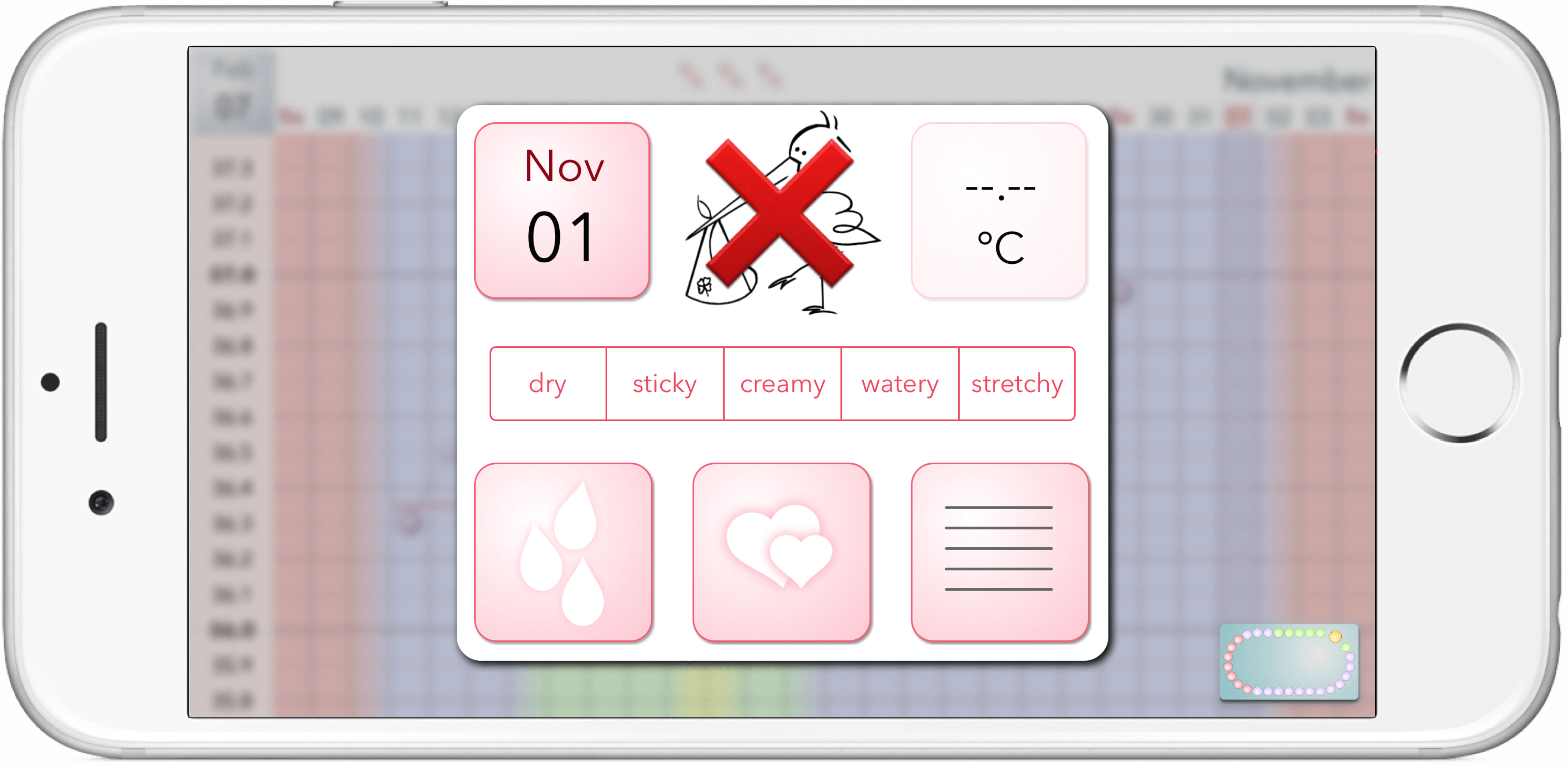
After activating the ovolane® app, the ovolane® calendar appears each time you start the app. Before you have made any entries or temperature measurements, it will look similar to the picture ovolane® calendar. You can scroll through the calendar by swiping – up or down. The current date is always displayed at the top left of the calendar. When tapping the current date, the calendar automatically scrolls to show the current date. When you hold your smartphone horizontally (landscape-mode) , the ovolane® calendar disappears and the so-called graph calendar is displayed.
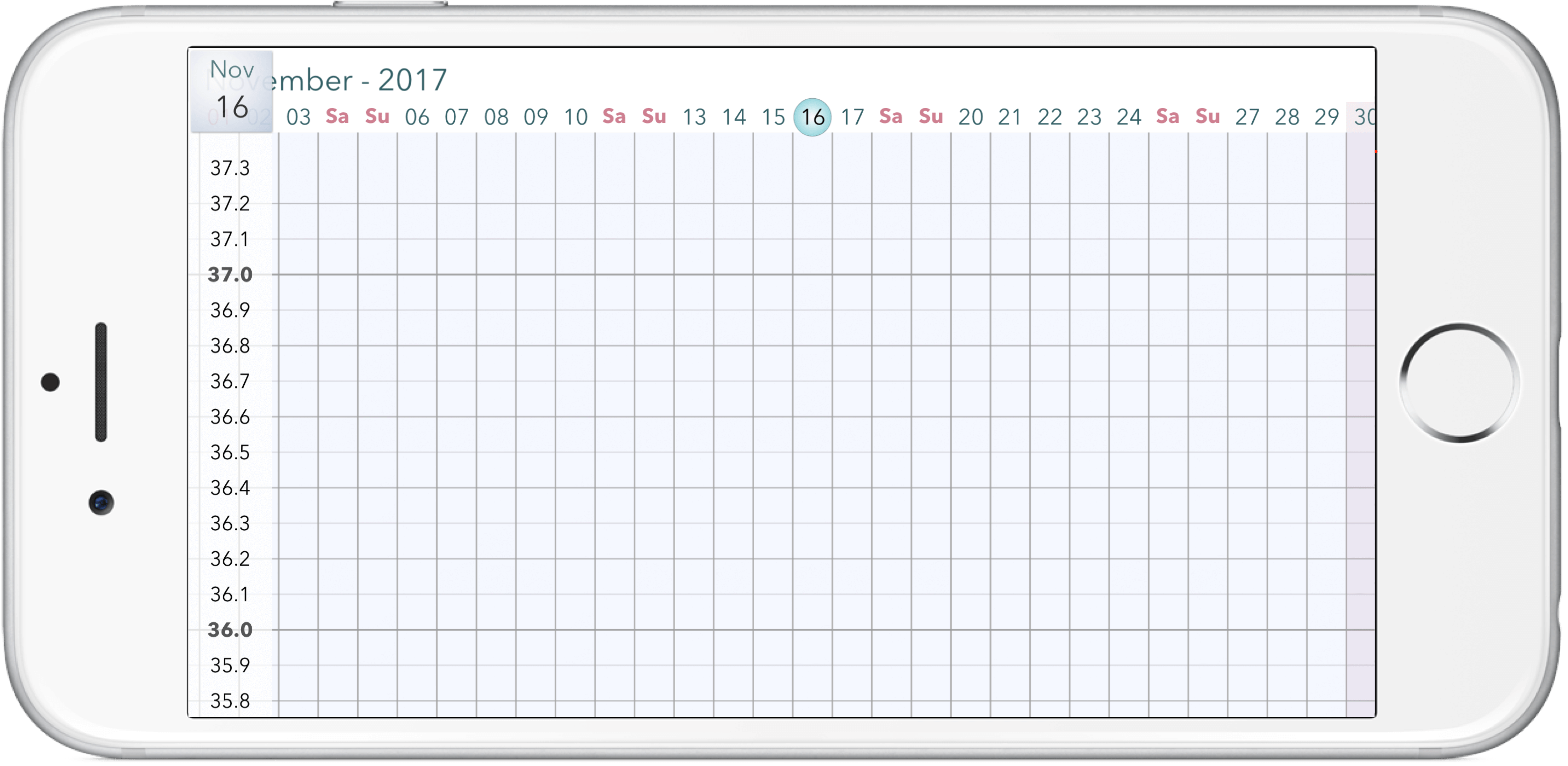
graph calendar
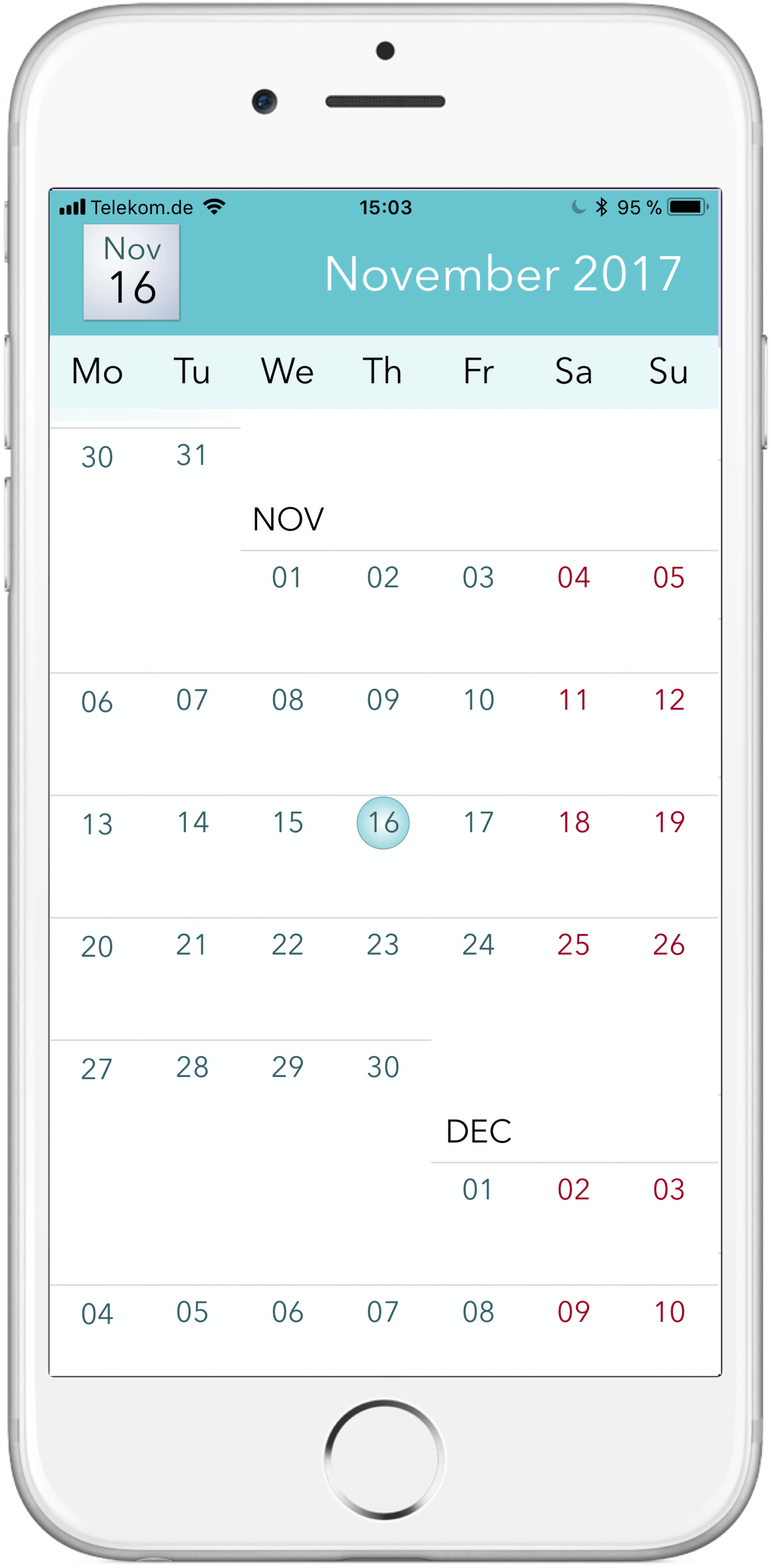
ovolane® calendar
The graph calendar displays a column for each day and features a temperature scale on its left hand side. You can also browse the graph calendar with swipes, here – left or right. Just like the ovolane® calendar, the graph calendar displays the current date in the upper left corner. Likewise, the graph calendar scrolls to the current date when you tap it.
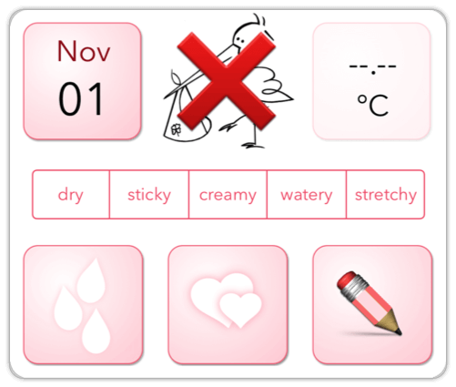
If you tap a day in the ovolane® calendar, its corresponding day report appears.
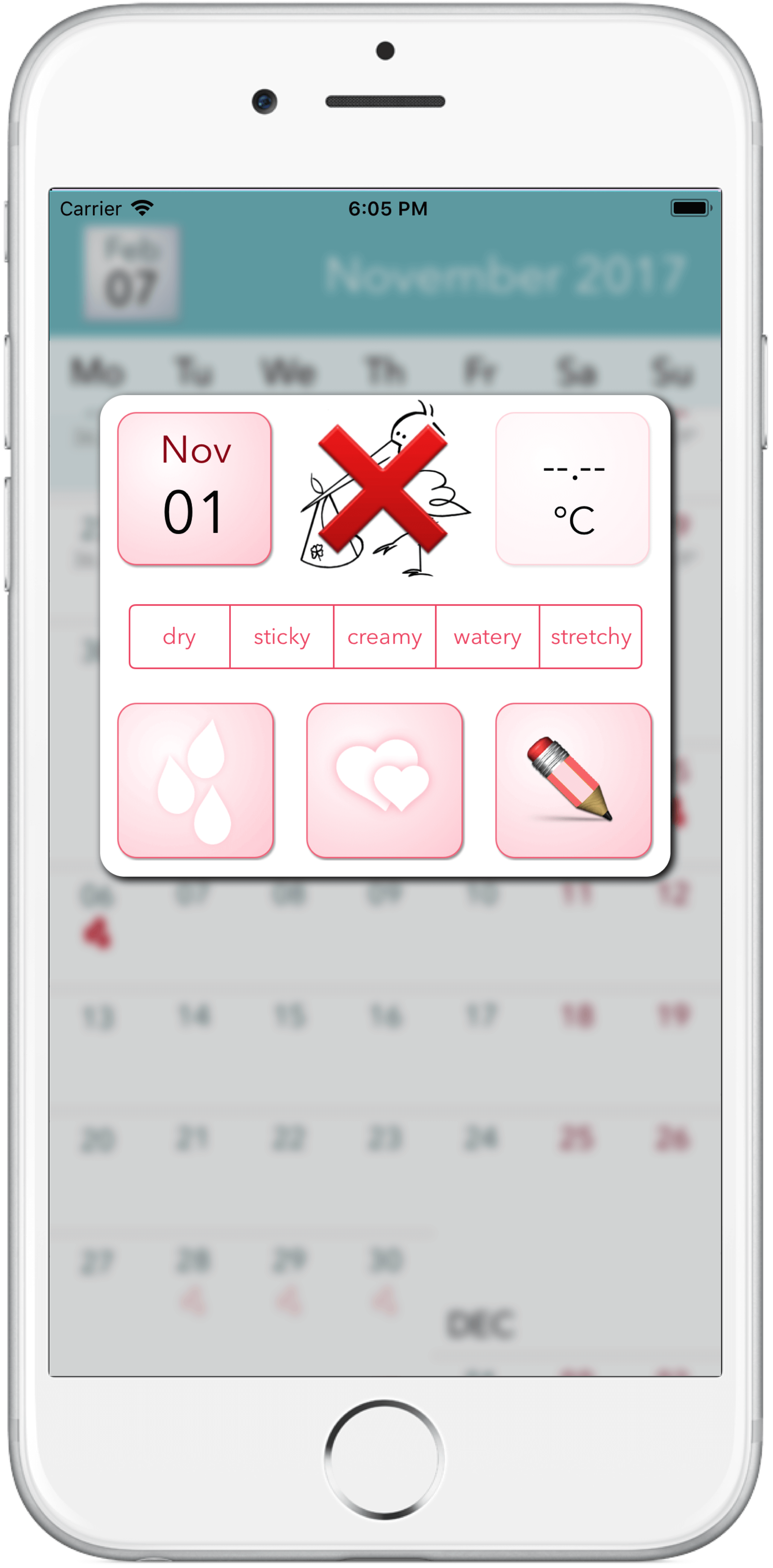
ovolane® calendar
This also happens when you tap the column of a day in the graph calendar.
graph calendar
The day report will not appear for days, which are in the future, obviously for future days no information is available or can be entered.
day report
The Day Report
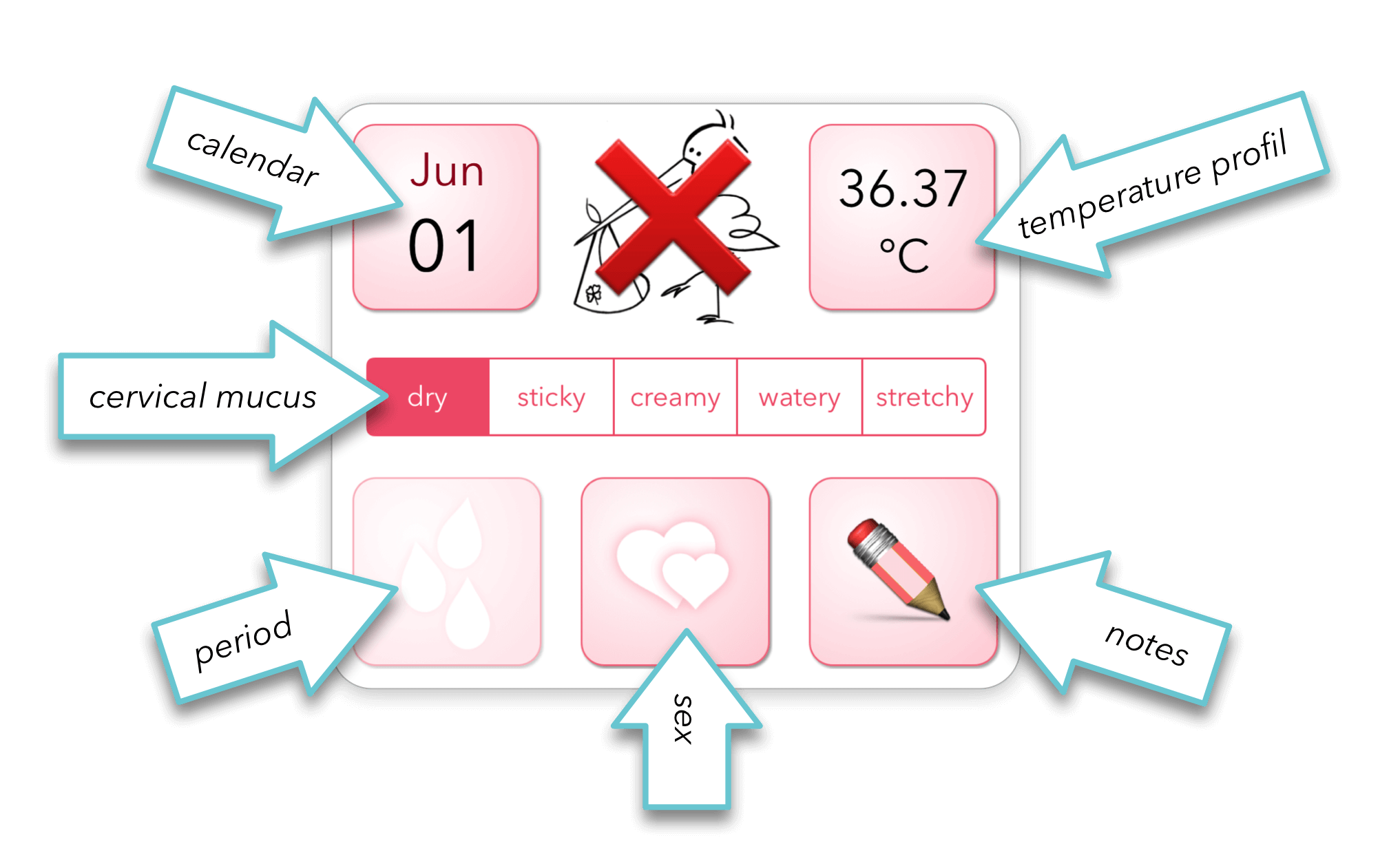
The day report is basically your control center. Here you can provide further details, for possible evaluation by the ovolane® app. The day report features a total of 6 buttons, marked with arrows (see picture).
day report
The “Calendar” button (upper left) closes the daily report.
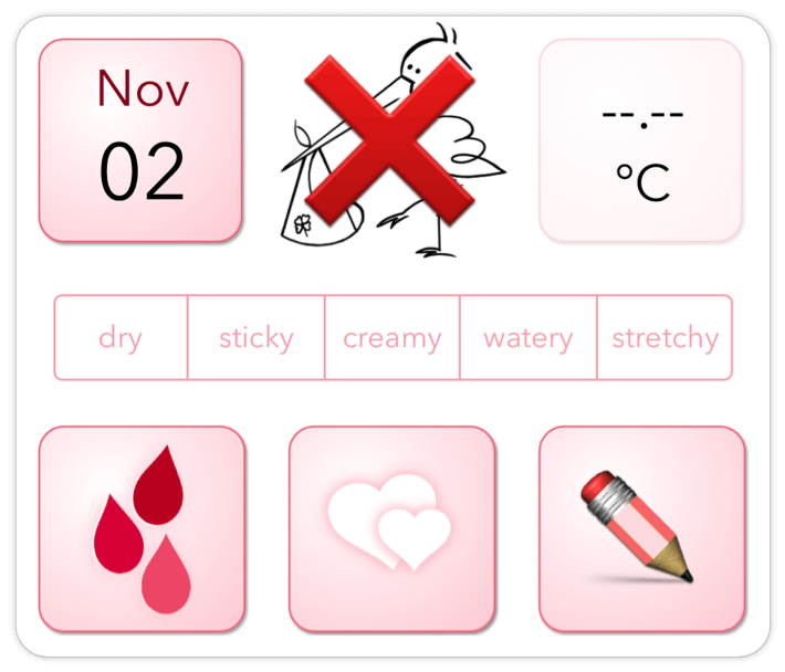
When the “Period” button is tapped, the white droplets turn red, tapping them again causes the colors to turn white again. For the app to function correctly, it is especially important that you mark the days of your period accordingly. The ovolane® app calculates your cycle length from the information you provided for the start date and the end date of your period. In order for the app to make reasonable predictions about the length of your cycle and the time of ovulation, the data provided must be complete and correct.
day report indicating menstruation
In the same way, you can tag days with hearts. This information can later be evaluated by the app as an additional* indication for possible pregnancy. The date of birth can also be calculated quite accurately from the date of possible perception. Based on this information, the ovolane® app can even evaluate the different chances for female or male offspring.
*Primary indications are that the period is suspended and the temperature is sustained.
If you like, you can also mark your cervical mucus consistence in five stages – outside of your period. This information is not mandatory, but provides you with an additional indication with regard to your current fertility.
Then, there is also an area for arbitrary notes.
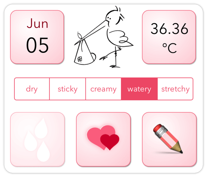
day report showing perception possible
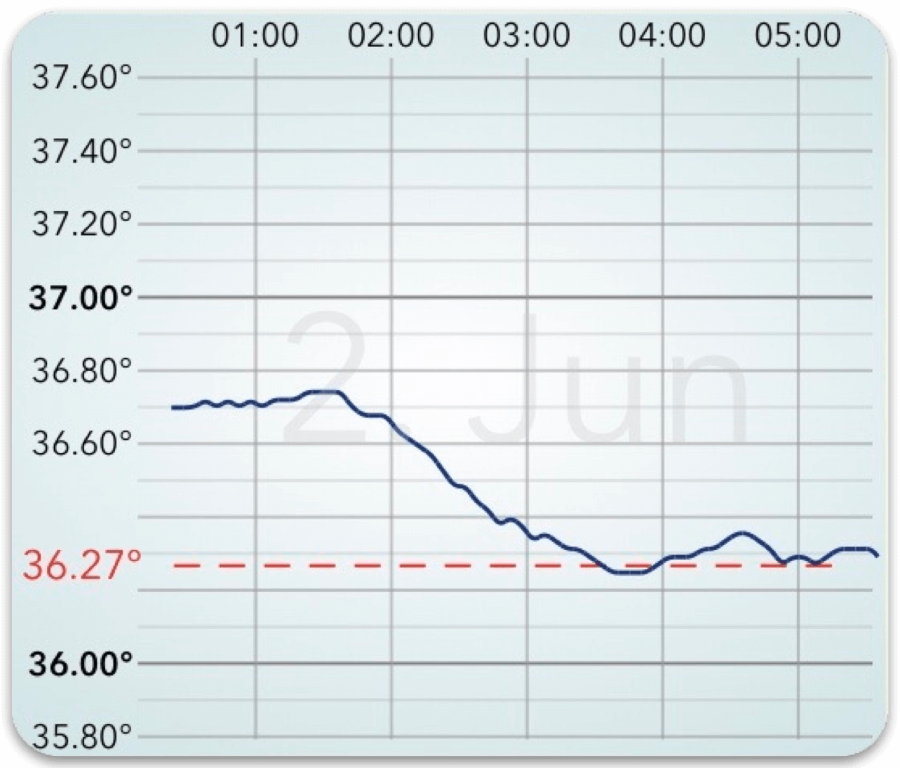
At the top right of the day report, your basal temperature is displayed for the day indicated (Feb – 26th in the example) provided you had used the ovolane® sensor that day. When you tap the basal temperature, the temperature curve appears that was recorded by the sensor during your sleep. – The ovolane® app has derived the so called basal temperature from that curve. The temperature curve shows the progress of your body temperature during your sleep. If you tap the temperature curve, it will disappear and the day report will reappear.



Not to be missed is the stork in the middle of the upper section of the day report. The probability of successful pregnancy is noticeably higher on the days when the stork is neither crossed out nor questionnelled. If the pale stork is behind a question mark, no statements on fertility can be derived from the available temperature history.
Important:
Ovolane® is a lifestyle product for women who need a precise ovulation monitor for their own fertility awareness.
We expressly point out that we do not offer ovolane® as a means of contraception (within the meaning of Directive 93/42/EEC).
The ovolane® Calendar
The ovolane® calendar provides an overview of your day reports in form of a calendar. Each line displays the 7 days of a week – Monday to Sunday. Each day, summarizes the most important information of the respective daily report, namely the basal temperature of the day, blood droplets, a pencil and/or hearts. Ovolane® also tries to predict your next periods and highlights those days with pale blood droplets. The longer you use Ovolane® and feed it with the correct menstrual data, the more reliable the predictions will become over time. Likewise, ovolane® also tries to predict your future time of ovulation and fertility, and marks it with a pale color gradient of light-turquoise over dark-purple and yellow (ovulation) stretching over several calendar days back to light-turquoise.
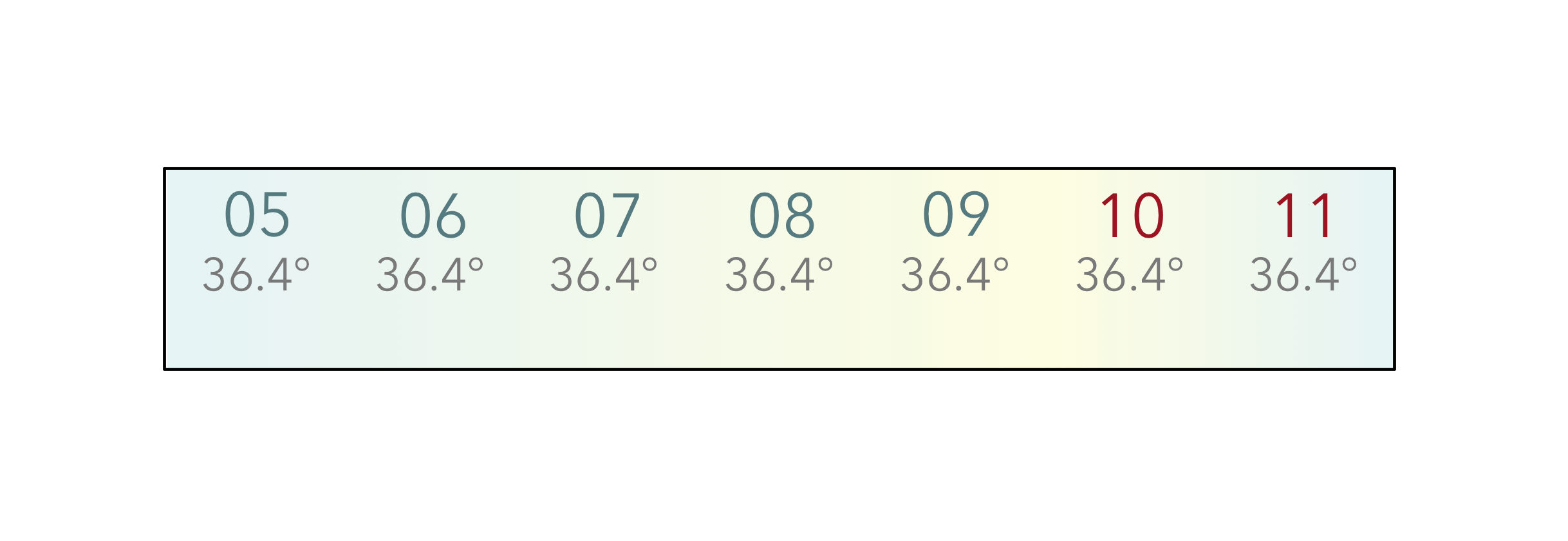
fertile phase
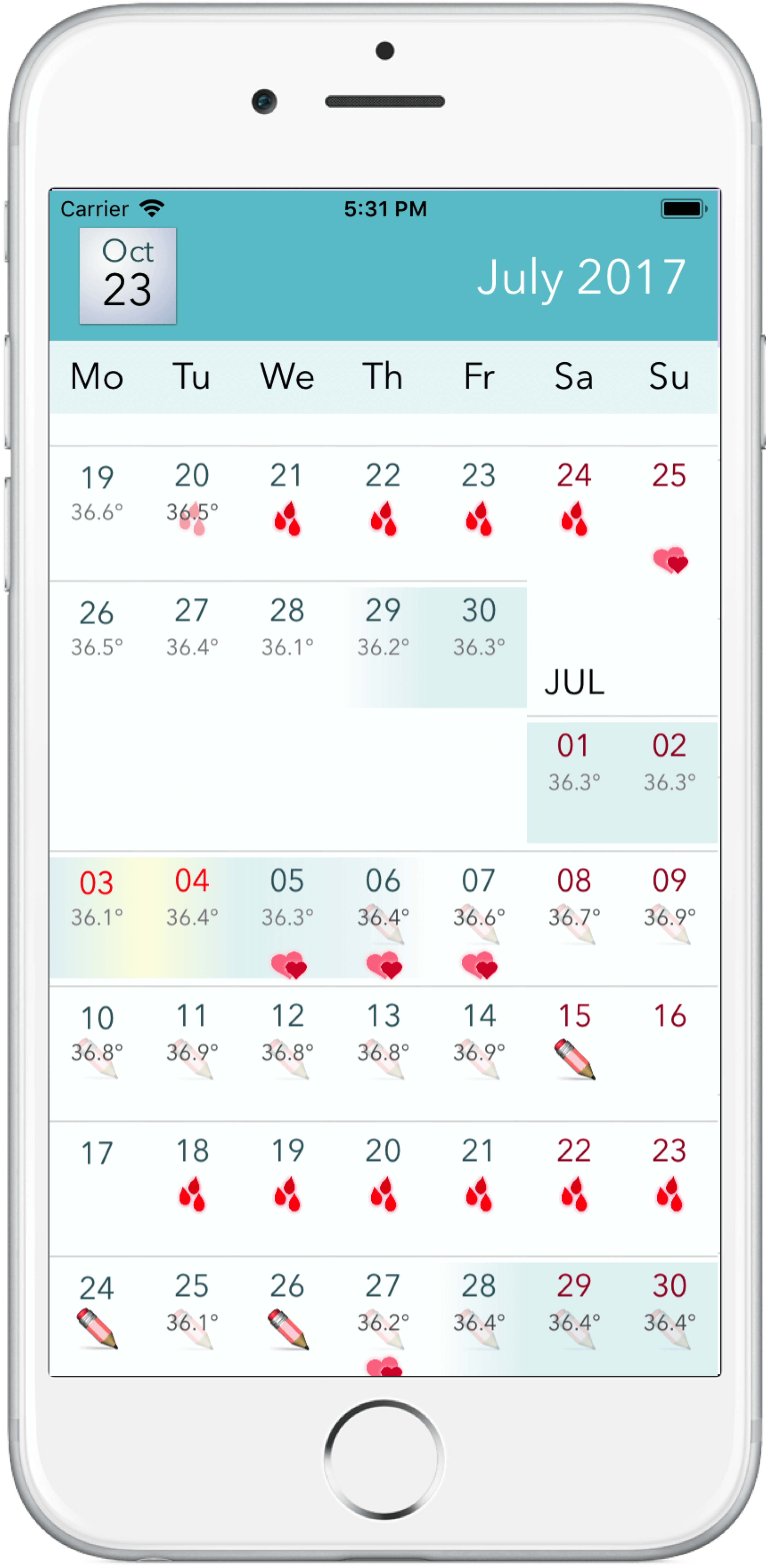
ovolane® calendar
The Graph Calendar
When holding your smartphone horizontally, the ovolane® calendar (see above) disappears and the graph calendar appears. The graph calendar displays your daily measured basal temperatures as a “temperature curve”. From this you can read the ovulation time and your fertile days.
The displayed temperature values are rounded to 0.05 ° C. The color gradient (dark-green to yellow) of the different beads corresponds to the course of the cervical mucus consistency, as it results from your input in the daily report. If you do not set a specific cervical mucus consistency (or “dry”) in the daily report, the corresponding pearl will appear purple.
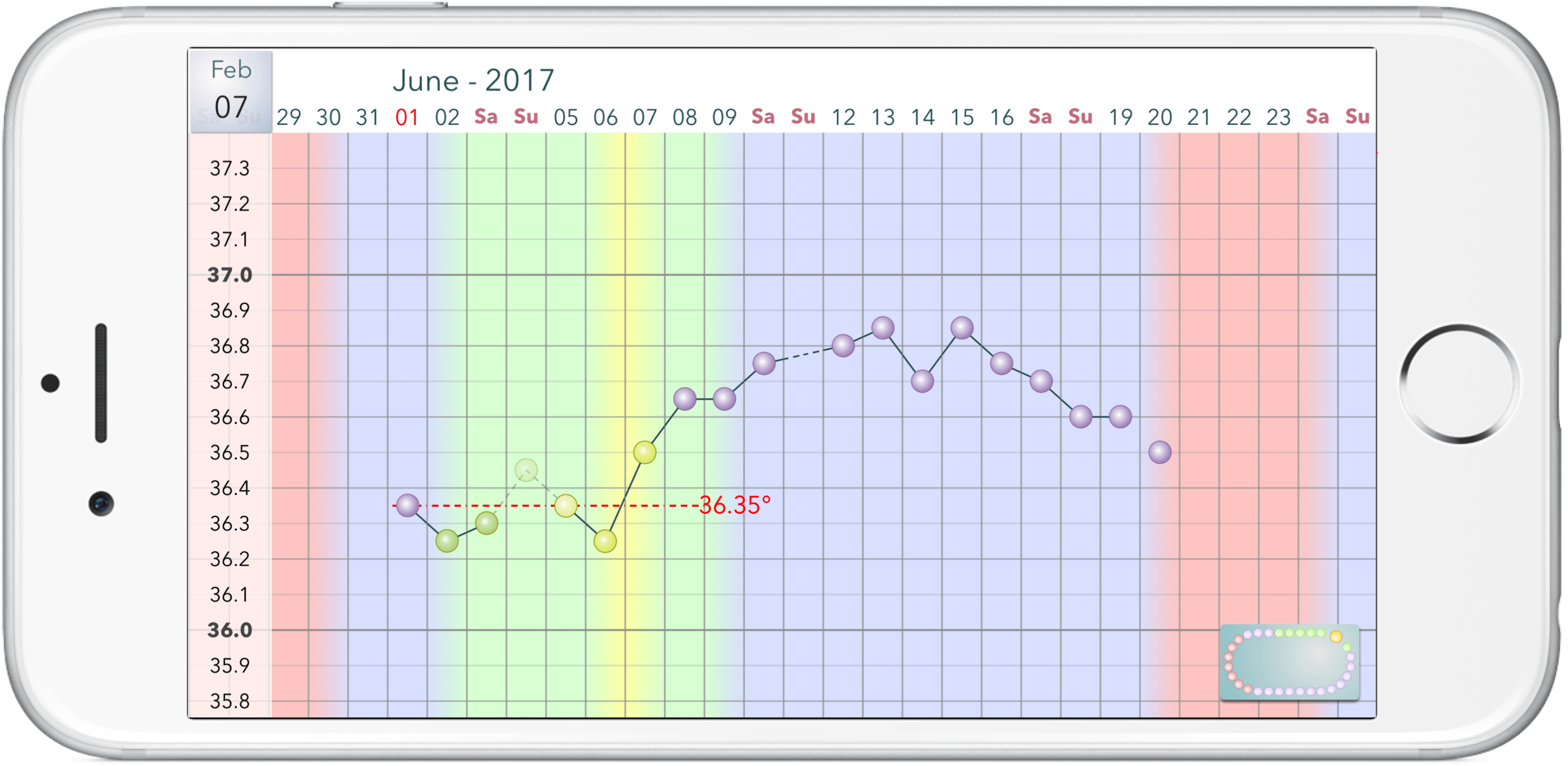
graph calendar
The ovolane® app evaluates the temperature curve automatically and displays the result through different column colors for each day. The reddish columns mark your period, the green columns mark the days with a higher probability of conception, the blueish columns mark the days with less probability of conception or sterility, respectively. The yellow mark indicates the day or time around which ovulation has occurred most likely. The best chance for becoming pregnant is in the green area – as close as possible to the yellowish area.
When you tap the button at the bottom right, the cycle calendar replaces the graph calendar.
The Cycle Calendar
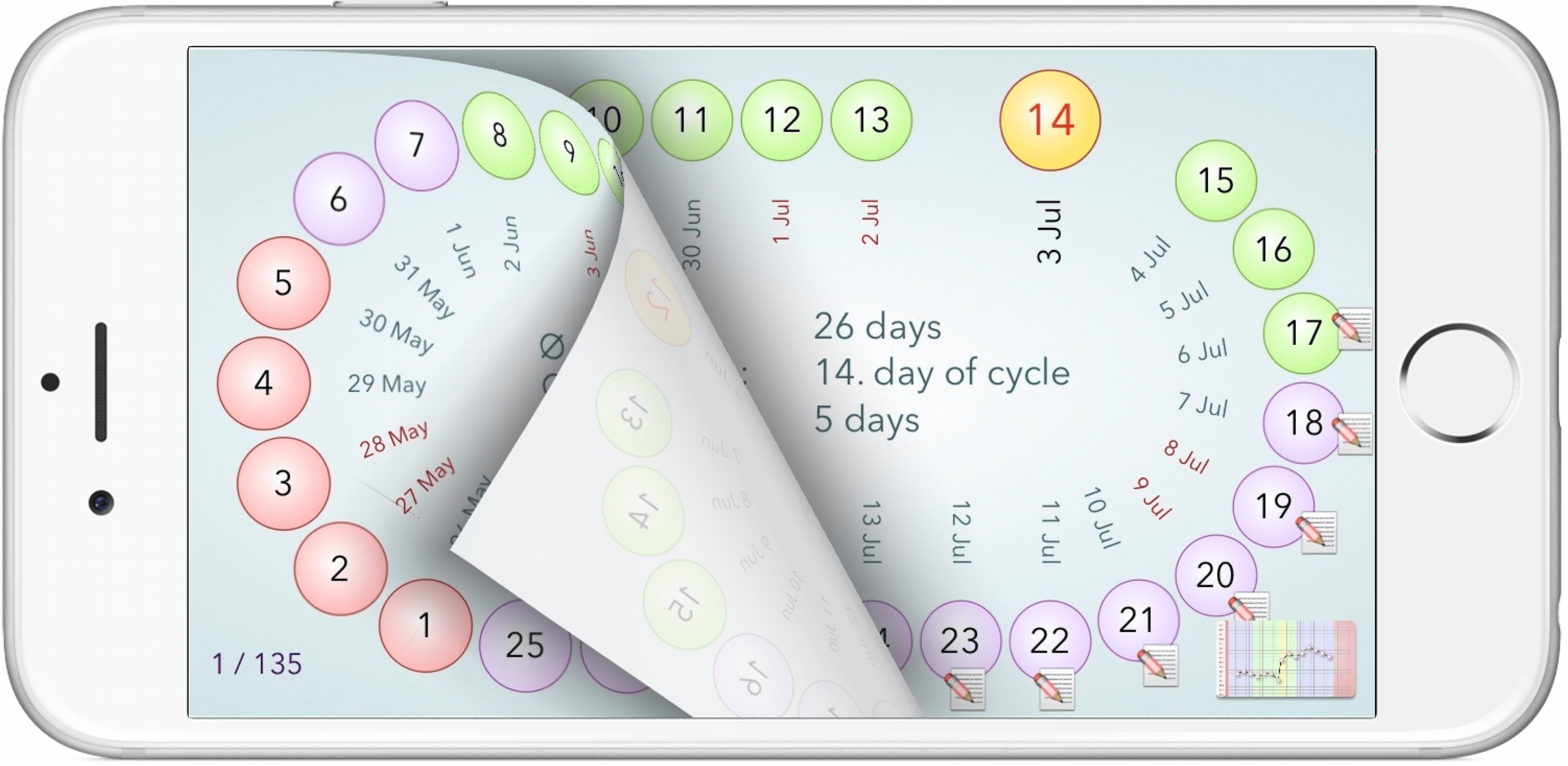
The cycle calendar shows your cycle as an oval arrangement of different colored beads. These beads are numbered corresponding to the days of your cycle. The first day of your cycle has the number “1”, regardless of the actual calendar day, which is visible next to each bead on the inside of the oval. The colors of the beads are the same as the colors of the columns in the graph calendar. Thus, the reddish beads mark your period, the green ones mark the days with higher probability of conception, and the blue ones mark the days with less probability of conception. Accordingly, the yellowish, slightly larger bead indicates the day or time around which your ovulation most likely took place. Inside of the the oval are statistical data as they can be calculated on the basis of the information of your most recent cycles available so far. If you tap a bead, the corresponding day report will appear. You can flick through through the cycle calendar chronologically – back and forth – by swiping.
When you press the button on the lower right, the cycle calendar disappears and the graph calendar reappears.
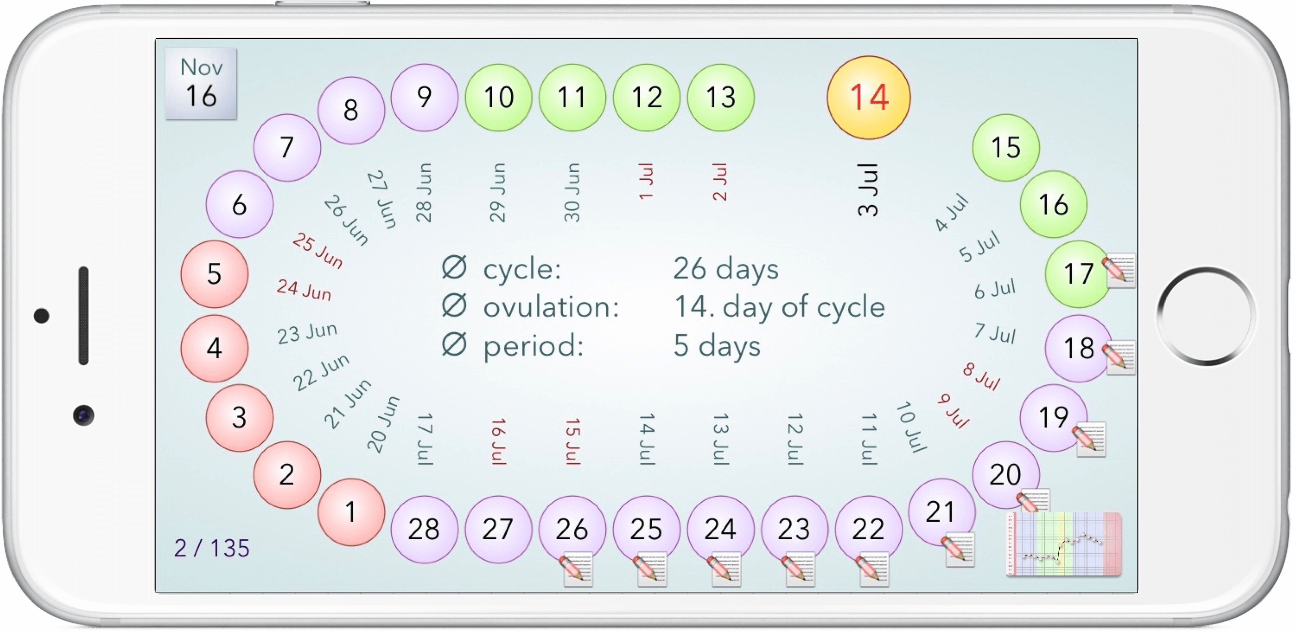
cycle calendar
